I was sufficiently pleased with the results of my previous experiments to create 2D images by having Microsoft Copilot write code for Processing. Accordingly, this week, I wanted to move on to slightly more advanced experiments, namely using Microsoft Copilot and Processing to create simple animations. One quick notes is that Processing does not typically output movie files, so instead I used QuickTime to make screen recordings in order to capture these animations.
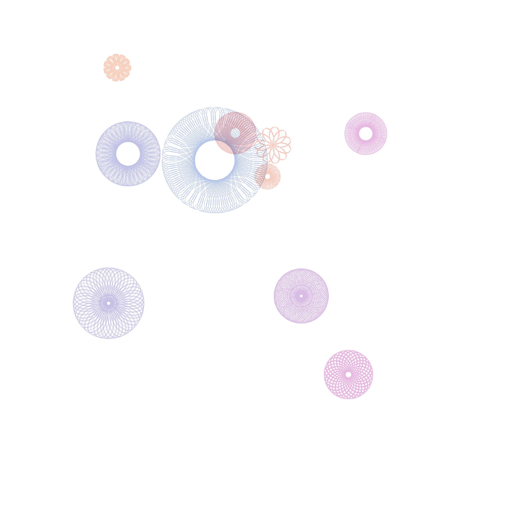
I built the first experiment off of the spirograph visualization of the ten brightest stars in the Milky Way. I simply asked Copilot to add some randomness to the spirograph code to create an animation effect. Notice how the various spirographs each moves at its own rate, which I think is a nice feature.
I then had processing create code that would create a video analog of waves in the ocean.
Then, I had Copilot write code that would generate an animation of a constantly morphing plaid pattern.
Regardess of the specifics, these experiments indicate the potential for Processing to create animation that could be used to demonstrate basic scientific principles (such as the wave animation above), or to create animations that could be used in social media posts, or be used as part of a music video.
I am in a working group of faculty tasked with finding ways to incorporate generative AI, specifically Microsoft Copilot, into their workflow. Given my background as a music maker, my intent is explore creative applications of Microsoft Copilot in music, as well as the arts in general.
One use for generative AI is to use it to write computer code. In addition to standard programming languages, such as C++, JavaScript, and Python, Microsoft Copilot can generate code in numerous other languages, including languages that are orient to creating music and graphics. In terms of graphics creation one such programming language is Processing. Amongst other things, Processing will create 2D images and video, as well as interactive images and video using computer keyboard, mouse, and MIDI data as means of input. Clearly this language offers a lot of cool potential for image and video creation, but let’s start out fairly simply to begin with. Let’s start with using data visualization processes to generate graphic scores for music.
Graphic scores are an alternate means of music notation that are commonly aligned with improvisation or aleatoric (chance) music. While generally associated with modernism and post modernism, graphic scores have a long history. One of the earliest surviving examples is a 15th century composition called Belle, bonne, sage by Baude Cordier. The score for this piece is written such that the music looks like a heart.
Data visualization is a more established more conventional process. The core of the practice is to map data on to visual elements to aid in the analysis of a large data set. A successful visualization can help a researcher identify trends or identify anomalies. Some data visualizations can really be visually compelling. Are data visualizations art? I think many may disagree on that. However, can data visualizations be art? I think the answer to that is a definite yes. If we alter the goal of a visualization from being able to reveal patterns and anolamies to researches to the goal of creating a stunning or compelling image, such an image would count, as far as I am concerned, as visual art.
The visual nature of graphic scores often create a curious situation. Namely, many graphic scores are sufficiently compelling enough to count as visual art. However, in use, these visual works would only be seen by the performers, and not the audience, unless the instructions tell the performer to display the score in such a manner that the audience will see it. Accordingly do graphic scores have to be visually compelling? I would say that they do not. They simply have to convey the situation the composer wants to communicate to the performer in an effective way. However I think it does matter if a graphic score is visually compelling. Such a compelling image can potentially inspire a perform, and it may also encourage the performer to take the composition more seriously.
In terms of this experiment that’s where generative AI and Processing come into play. For this experiment, rather than asking generative AI to come up with an image for me to use, I ask it (in this case Microsoft Copilot) to generate Processing code that will generate a visualization of a set of data. As is the case with any use of generative AI, it is possible that that AI may hallucinate and create data that doesn’t exist. So, the results would have to be verified if we were going to use it for research, but we aren’t. In this case we are using it to create a compelling image for use as a graphic score.
I started by asking Microsoft Copilot to generate Processing code that would display spiral graphs. I then asked it to add color, to have the center points spiral out from the center, and to allow the use to save images. From this starting point, I asked it to generate code that would visualize astronomy data. Specifically I asked it to use the ten brightest stars in the Milky Way to map declination onto the x axis, ascension onto the y axis, and brightness onto Spiral size. At this point I also asked it to include a degree of randomness not related to these three parameters so it would generate different outputs each time.
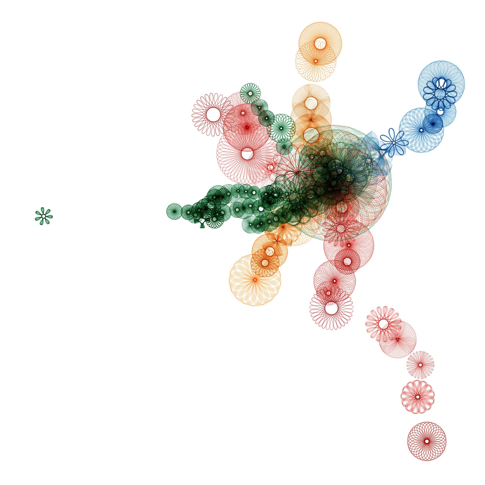
Occasionally the code it generated would not work, so I would tell Microsoft Copilot what error was returned, and it would regenerate the code such that the error was fixed. Regardless, I found the ten brightest stars experiment to be a good proof of concept. Being a fan of transportation, especially commercial aviation, trains, and subways, I decided to move onto a series of experiments involving Boston’s MBTA. Initially I asked Copilot to generate processing code that displayed 50 spiral graphs, each of which relates to the 50 most used subway stops for the MBTA, mapping usage of the station onto size, and using the color of the spiral graph to denote which subway line it relates to.
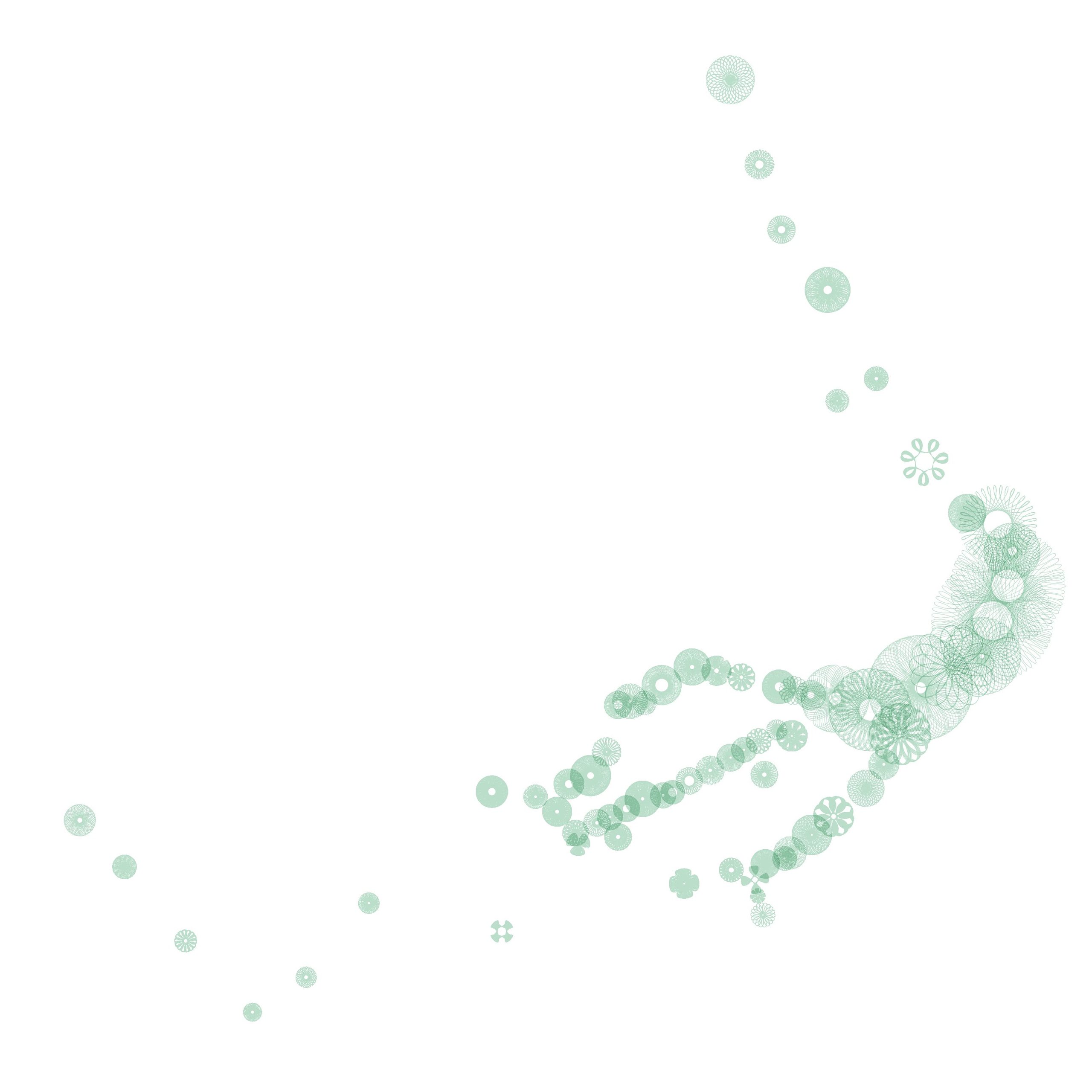
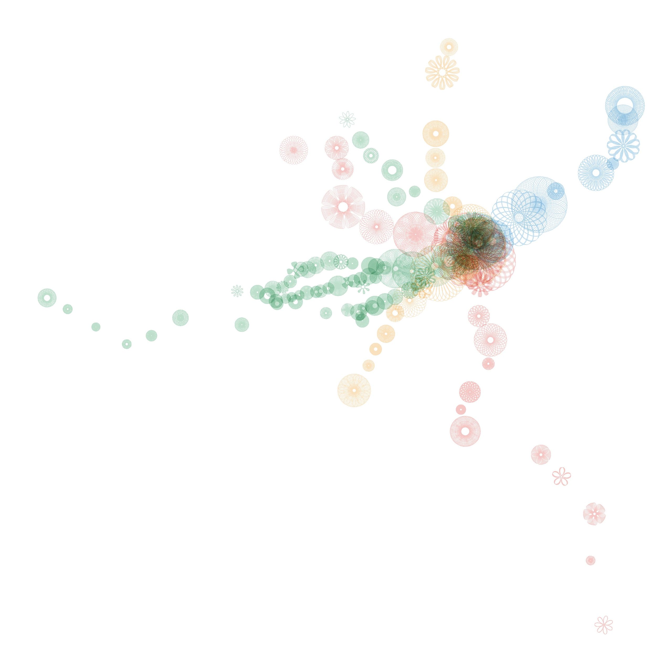
I found this image to be sufficiently compelling to imagine a graphic score for four or more players, where each player was assigned a route: the green, red, blue, or orange lines. The east / west axis could be mapped onto time, while the north / south axis could be mapped onto pitch. The size of each spiral could be used by the performer to choose the number of notes a given event would consist of, and / or to determine the volume of the event. After several experiments I decided it was necessary to include every single subway station, in order to avoid too much silence, and to give each performer ample opportunity to be involved. Note that the green line offers (by far) the most events with 70 stations.
The red line follows with 22 stations.
The orange offers 20 stations.
The blue station comes up last with only 12 events.
Note that each subway line offers its own distinct contour. The composite score of these stations offers a sparse solo by the green line for the first half of the piece, a busy ensemble for the middle of the work, and a directional, but increasing sparse duo between the red and blue lines at the end.
The ethics of this are certainly disputable. Could I have done this? That is learn yet another computer programming language and write a program that would translate a data set into an image? Yes, undoubtedly I could have. It is in my still set, but I imagine this has saved me tens of hours of work. As time goes on I could learn Processing code well enough to hack the code myself and eventually write my own code. Also, there’s the small matter of learning the mathematics behind spiral graphs. This is also I could have learned on my own, but again, this saved me tens of hours of work.
How does this make me feel as a creator? I’m personally alright with it, as I could have created this piece on my own by doing 15 minutes to an hour of research online to get the data, and then create a score by plotting it by hand using graph paper and colored pencils. This would have likely taken me an hour or two to accomplish, but it would have looked crude and unpolished. Also, I would not have been able to do the spiral graphs. I would have just made dots of various sizes. So, I would easily have been able to create this piece without AI, but it would have looked sloppier, less professional, and cruder. Since I am primarily a musician / composer, and not a visual artist, I don’t feel that the essential part for me (the music) would be substantially different one way or the other.
Another useful comparison I would make in this scenario would be the idea of hiring a professional music copyist to clean up my notation for a performance or publication. When you hire a professional copyist, that individual is not making any creative decisions, they are simply making the composer, arranger, or orchestrator’s creative decisions more legible. However, I would argue that in the sake of honesty it would be worth declaring the use of AI in the score itself for this particular experiment.




#/media/File:CordierColor.jpg)